Create a Dashboard
Use your existing charts to create a new dashboard!
Dashboards are simply a collection of charts and markdown to build a story using data. Let's create and share our own new dashboard!
Discovering Dashboards
Creating Our Own Dashboard
To create a net-new dashboard, click on the top tab "Dashboards" and "New Dashboard":
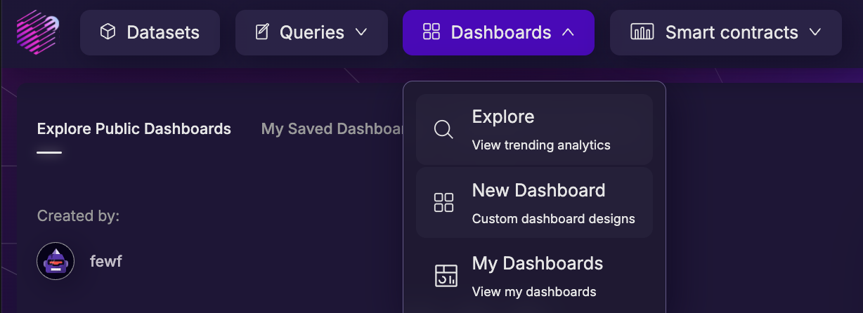
This will open up the dashboard editor. The main space is a drag-and-drop dashboard editing space. The right side has several options for adding items to your dashboard:
Add Your Charts
The "Visualizations" section should display all of the charts you've created. Let's add our charts created in the previous "Creating Queries and Charts" activity to this dashboard.
- Click on the "Visualizations" section
- Simply drag-and-drop from the display to the main editing space
That's it! The main editing space is drag-and-drop, so move the graphic around until it fits where you want it. If you want to resize the component, find the handle in the lower-right corner (white edge) and drag to the desired size.
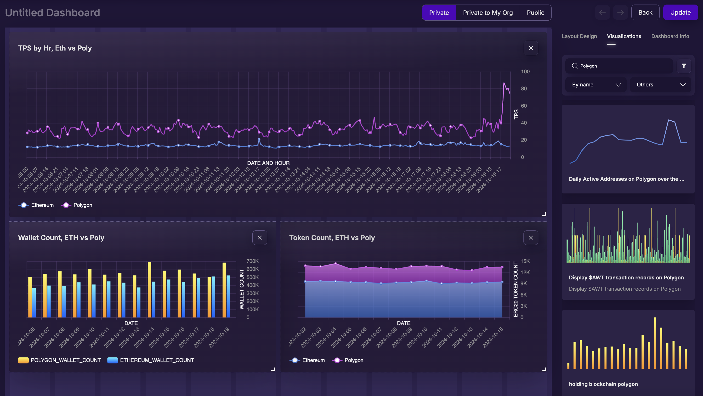
Above, we've elected to make the hourly TPS line chart the widest, and make the other two daily charts half-width. But you can do whatever you feel tells your story the best!
Add Other's Charts
You can also search and use other user's public charts! This is great for using other's work to augment your own, or sharing your findings to friends for use in their dashboards!
Note in the image above, the "Visualizations" parameter changed from "My Visualizations" to "Others" to search for public charts. Now when searching for "Polygon", the search will look for all public charts, not just "My Visualizations".
Look through the public charts, and drag a few interesting analytics onto your dashboard.
Add Layout Components
Click back over to the "Layout Design" tab. The top option here is to "upload Header image". This sets an image for your dashboard, and allows you to easily personalize!
Adding a Header Image starts with finding a good image! For the example here, we'll use an interesting image found on a CoinGecko article comparing Ethereum and Polygon. That said, you can use any image you'd like! To upload the image:
- Save the image to your local computer (if needed)
- Make sure you're on the "Layout Design" tab
- Click on the button marked "Click to Upload Header Image"
- Upload your image
Done! You'll notice a new interface appeared directly below the "Header Image" section:
"Color your dashboard" - Space and Time Studio performs a color analysis of your image, and generates several matching theme options. Click on the color themes, and you'll see the various charts and background colors adjust to match that theme. This is great for branding a dashboard quickly, while ensuring the colors match your header image!
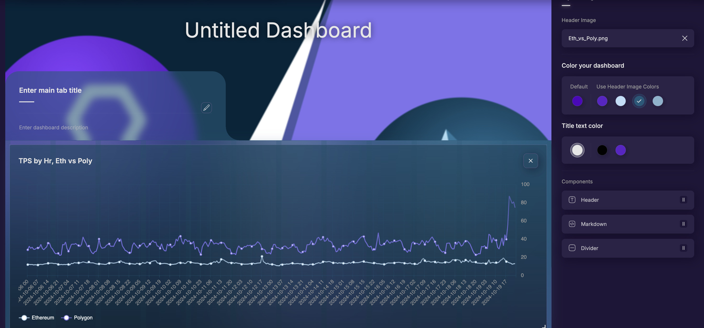
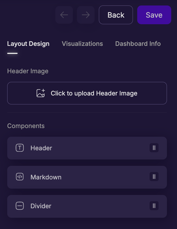
Below the colors, you'll find other layout components you can drag-and-drop onto your dashboard: Header, Divider, and Markdown components. The three are similar but different:
- Divider - a simple horizontal line across the entire dashboard. This cannot be interrupted by other charts (i.e., it must stretch across entire dashboard), so it's good for a gentle break inside a section.
- Header - a named section title. Similar to a divider, it stretches uninterrupted across the entire width of the dashboard, but unlike divider, it contains text. You can also edit the text content, size, and transparency.
- Markdown - A freeform Markdown text box, that can be placed and resized like a data chart. Unlike the other two above, it can be resized and can be placed side-by-side with other content. The intention is to provide other, non-data related information to help tell your story.
Let's add two headers, one to label "My Work" and one to label "Additional Analysis". Similar to charts, this is very easy:
- Make sure you're on the "Layout Design" tab
- Drag-and-drop the Header object onto the editor's working space, and arrange as you see fit.
With that complete, let's also add two "Markdown" boxes, and provide our users some high-level information about the two blockchains in our analysis, Polygon and Ethereum. Similar to headers, this is as easy as:
- Make sure you're on the "Layout Design" tab
- Drag-and-drop the markdown box onto the editor's working space, and arrange as you see fit.
Now, we need to edit each of the two markdown boxes and add some content. There are many markdown tutorials in the world, and so out-of-scope here. However, do note that markdown allows simple HTML tags as well, making these markdown boxes quite powerful.
For now, you can copy-paste the markdown provided below, which are the first few sentences from Wikipedia on our two blockchains, Ethereum and Polygon. This also includes a picture (first line) and some text coloring in HTML (second line).
Ethereum Markdown:

<h1 style="color:blue"> Ethereum</h1>
Ethereum is a decentralized blockchain with smart contract functionality. Ether (abbreviation: ETH) is the native cryptocurrency of the platform. Among cryptocurrencies, ether is second only to bitcoin in market capitalization. It is open-source software.
Ethereum was conceived in 2013 by programmer Vitalik Buterin. Other founders include Gavin Wood, Charles Hoskinson, Anthony Di Iorio, and Joseph Lubin.
For more information, check out [this article](https://en.wikipedia.org/wiki/Ethereum).
Polygon Markdown:

<h1 style="color:purple"> Polygon </h1>
Polygon (formerly Matic Network) is a blockchain platform which aims to create a multi-chain blockchain system compatible with Ethereum. As with Ethereum, it uses a proof of stake consensus mechanism for processing transactions on-chain. Polygon's native token is POL, an ERC-20 token which allows for compatibility with other Ethereum cryptocurrencies. It is operated by Polygon Labs.
Polygon is a natively Layer-2 network that uses on Ethereum as a base network.
For more information, check out [this article](https://en.wikipedia.org/wiki/Polygon_(blockchain)).
Once saved, the two Markdown boxes should look like this:

Save your Work!
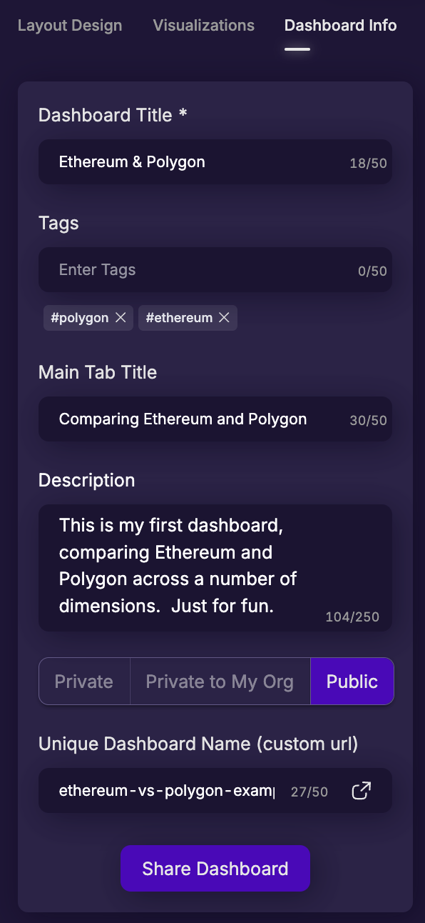
AFTER you mark a dashboard as "Public", a new option will appear at the bottom:
"Unique Dashboard Name (custom url)". This allows you to assign a custom url to your public dashboard, to help users quickly see what the dashboard is for. This custom URL must be globally unique among all users, so be descriptive!
To allow us to tie your dashboard back to your account for credit, please append your username to the END of your dashboard name. This will help tie your work back to your account.
For example, the dashboard being built in this example can be found here: https://app.spaceandtime.ai/dashboards/public/ethereum-vs-polygon-my-username
Using the sample text as seen above, you can see where each of these texts are placed in the final dashboard:
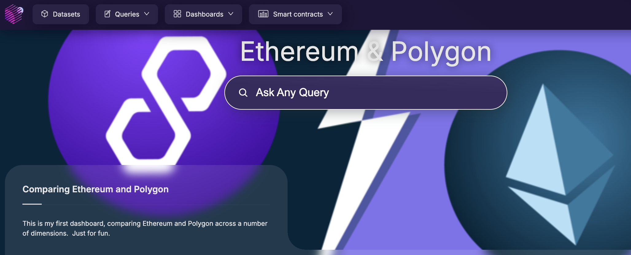
Mark your Dashboard as Public so it can be seen and verified by the accreditation process, make sure to save your dashboard and you're good to go!
Put it all together
The final dashboard example above ended up looking like this:
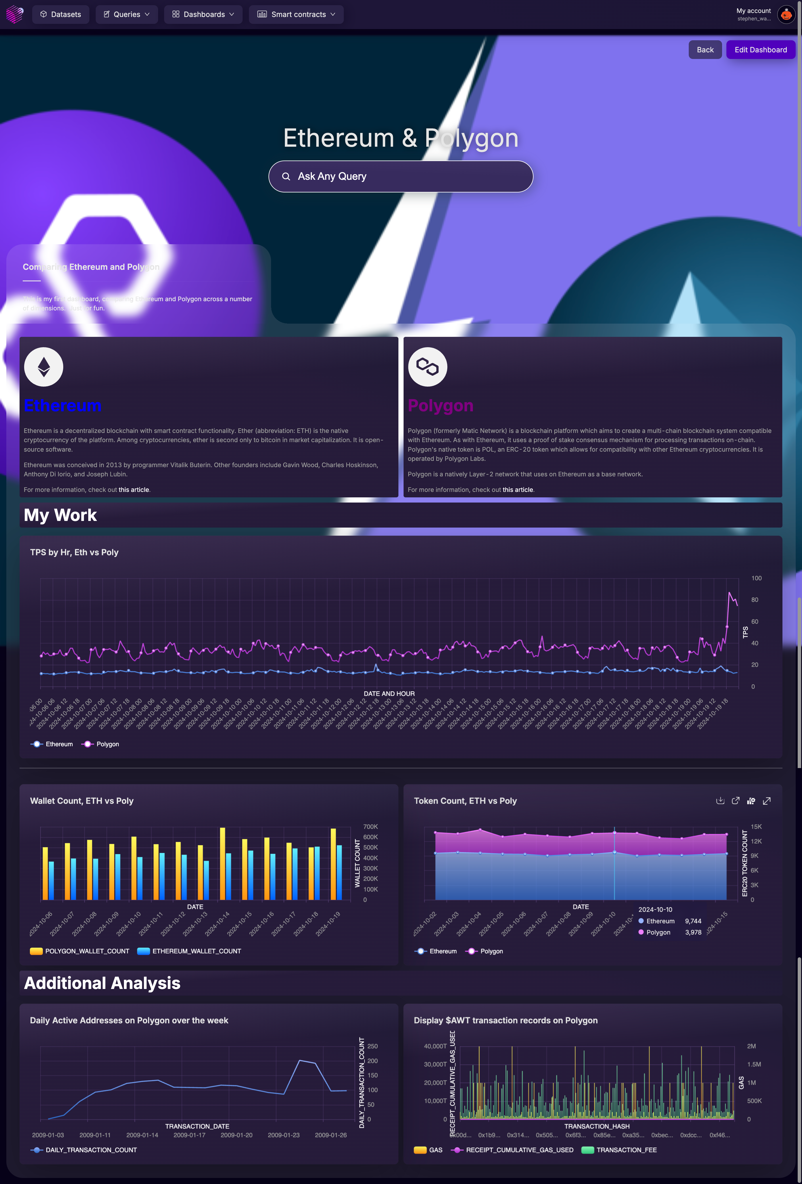
Yours may look different based on your choices, which is great! Now share your dashboard with friends! The can view it without even needing to login to Space and Time.
Get Credit:
You'll get credit for this activity if you:
- Create a dashboard
- Share it publicly!
- Give it a "unique public name" aka public URL that ends with your userid (all lower case letters is fine)
{/ looking for dashboard via API ending with UserID /}
Updated 5 months ago
